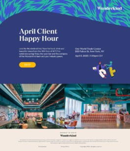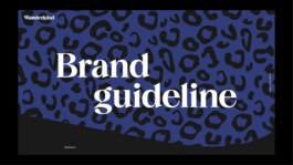
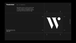
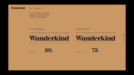
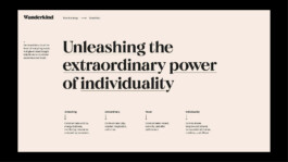
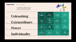
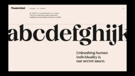
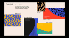
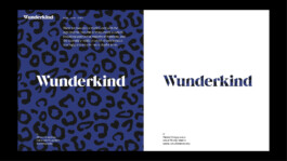
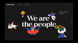
Wunderkind’s visual identity began with Multi Adaptor. They laid the foundation—the logo, the color palette, the system that gave us a language to speak.

I led the design from start to finish, working in partnership with Intelligent Demand, our marketing tech partner. Through weekly standups and iterative feedback, we turned a complex set of requirements into a cohesive, code‑ready site.
It wasn’t just a refresh—it was a chance to finally show what Wunderkind could do, all in one place.
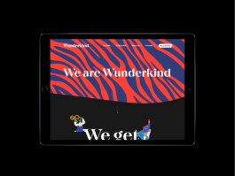
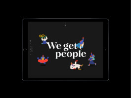
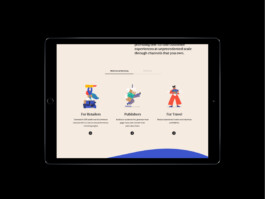
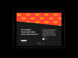
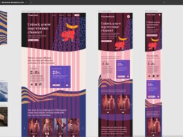
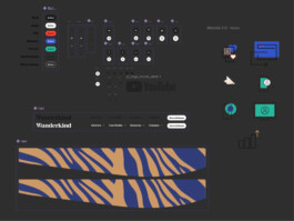
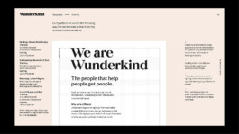
The old homepage lacked a structured grid—information was arranged freeform, which looked seamless but made it difficult to organize heavy copy.
We introduced a column system to bring order, creating reusable components that could flex with new content. The result was a cleaner, more scalable foundation that let the messaging breathe.
Event
Design
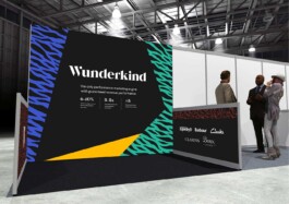
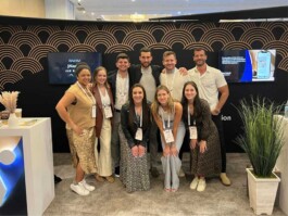
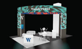
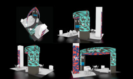
Every year at E‑tail West, we built a feature booth that had to be perfect.
The stakes were high: print deadlines were final, and everything from custom mechanicals to Pantone matching had to be exact. It was one of the most exciting projects I’ve worked on—a chance to make our brand unforgettable for the businesses that needed a marketing edge.
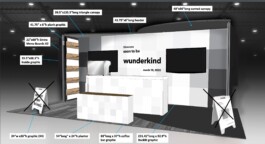
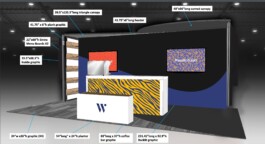
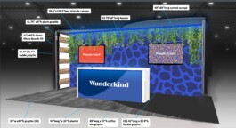
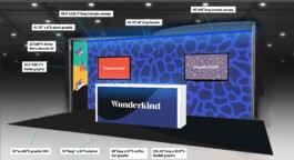


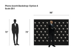
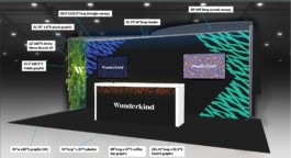
Our first task was always to get the vendor to send us the specifications of the graphic sizes so we can start drafting ideas for our event.
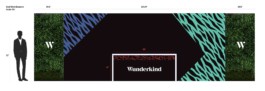
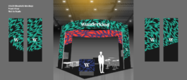
To ensure everything printed exactly as designed, I always worked to scale. I set my artboard at a 10:1 ratio in Illustrator and used the average human silhouette as my reference object.
Because vectors scale without loss, what you saw on screen translated perfectly to the final print: text sized correctly, proportions intact, no margin for error.

Misc.